When it comes to creating accessible public spaces, ADA signs play a crucial role. These signs are designed with specific features that ensure they can be easily read and understood by everyone, including those with visual impairments. Let’s dive into the anatomy of an ADA sign and explore the key elements that make them essential for inclusive environments.
Durable Non-Glare Acrylic
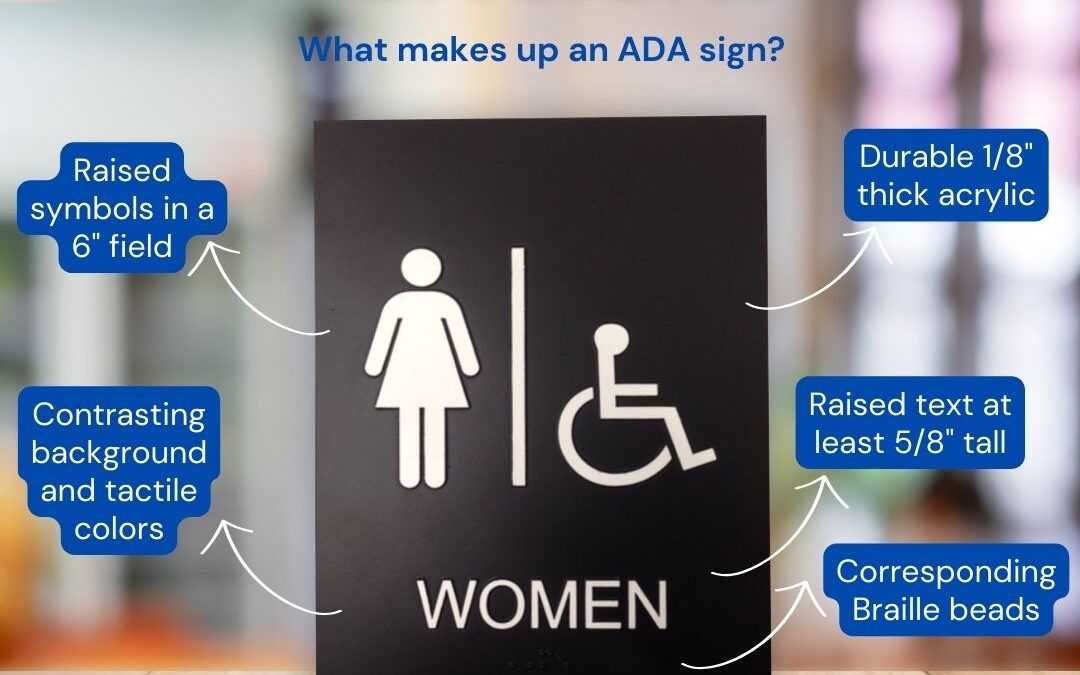
ADA signs are made from durable, non-glare acrylic, typically 1/8″ thick. This material is robust enough to withstand frequent use in high-traffic areas while also minimizing glare, which can make the sign difficult to read under certain lighting conditions. The non-glare surface ensures that the information is visible from different angles and lighting environments.
Contrasting Colors
One of the most important aspects of ADA signs is the use of contrasting colors between the background and the tactile elements. This contrast is crucial for those with visual impairments as it enhances readability. For example, a dark background with light-colored text or vice versa makes the text stand out, ensuring that the information is accessible to everyone.
Raised Tactile Elements
The tactile elements on ADA signs, such as text and symbols, must be raised at least 1/32″ from the background. This raised design is chemically welded to the sign to ensure durability and longevity. The tactile elements provide a physical way for visually impaired individuals to read the sign using their sense of touch. These elements need to be clear and easy to distinguish.
Sans Serif Fonts
The font used on ADA signs must be sans serif, which means it lacks the small projecting features at the end of strokes found in serif fonts. Sans serif fonts are easier to read both visually and tactically. The text needs to be a minimum of 5/8″ tall and can be up to 2″ tall, ensuring that the information is legible from a distance. It’s important that the font is not too bold, condensed, or italicized, as these variations can make the text harder to read.
Clear Symbol Guidelines
Symbols on ADA signs must be placed in a 6″ square field free from any other elements. This clear space ensures that the symbols are easily identifiable and not cluttered by surrounding text or images. Symbols are a universal way of conveying information, such as restroom locations or accessibility features, making them a vital part of ADA signage.
Braille Placement
Braille is an essential component of ADA signs. It needs to be placed 3/8″ to 1/2″ below the last line of raised text. This placement ensures that there is enough space for the Braille to be easily read by touch without interfering with the tactile text. Braille allows individuals who have low- or no-vision to read the information on the sign.
Smooth Edges and Rounded Corners
The edges of ADA signs need to be smooth to prevent any injury while reading the sign. Additionally, corners can be rounded to avoid sharp points, further ensuring safety. These design choices are particularly important for individuals who rely on touch to read the signs.
Proper Mounting Heights and Locations
ADA signs must be mounted at specific heights and locations to be effective. They are typically placed on the latch side of the door and should not be in the path of the door swing. This placement ensures that individuals can safely read the sign without risking injury from an opening door. Proper height placement also ensures that the signs are within reach for individuals who are standing or who use wheelchairs.
ADA signs are about more than just compliance—they are about inclusivity and ensuring that all individuals can navigate public spaces safely and independently. By incorporating features like durable non-glare acrylic, contrasting colors, raised tactile elements, sans serif fonts, clear symbols, and properly placed Braille, these signs provide critical information in an accessible manner. Smooth edges, rounded corners, and proper mounting locations further enhance safety and usability.
In schools, hospitals, hotels, office buildings, and other public settings, ADA signs play an invaluable role in making sure everyone can find their way. By understanding and implementing these key features, we can create environments that are truly accessible to all.