Dimensional letters made easy: materials, mounting, and when to upgrade to channel letters
Dimensional letters are a dependable way to deliver crisp branding on façades and interior walls without overcomplicating installs. For partner sign shops gearing up for pre-summer fit-outs, the right material and mounting choice can shave hours off an install and reduce call-backs.
This guide walks through the core substrates, finishes, mounting methods, paper template tips, ADA and wayfinding tie-ins, and how to decide between dimensional letters, channel letters, and push-through faces. You will also find a practical measurement and mounting checklist you can hand to your field team.
At Texas Sign & Graphics (TSG), our precision laser and CNC teams cut letterforms with tight tolerances for clean edges and consistent sets across multi-location rollouts. If you need letters that line up and mount cleanly on the first try, start here.
 What is a dimensional letter?
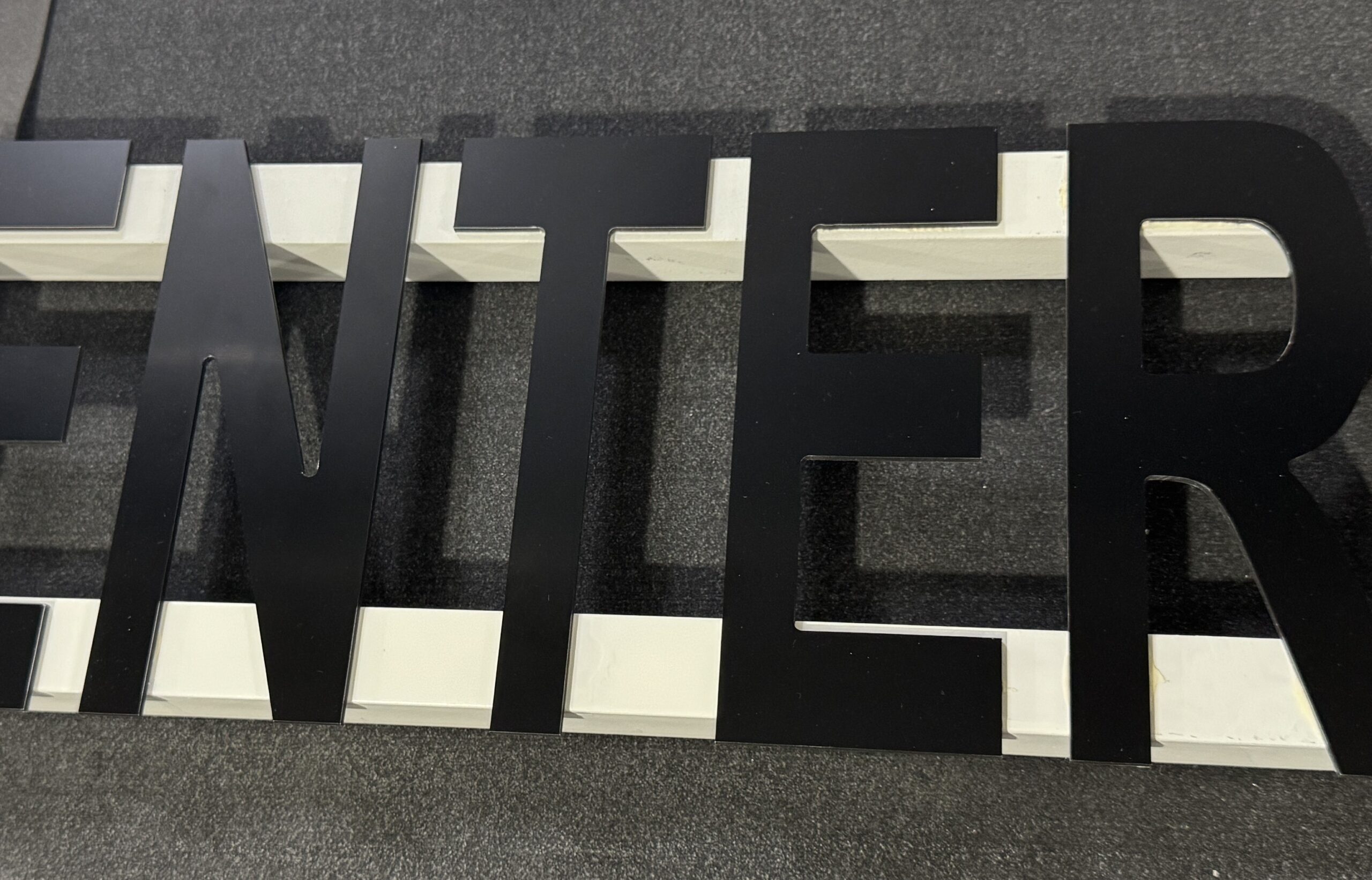
A dimensional letter is an individual character or logo element cut from a solid substrate, then mounted to a wall or façade to create a stand-off, 3D effect. Unlike a printed panel, each letter is a separate piece with real depth that casts a natural shadow. Common materials include aluminum, stainless steel, acrylic, PVC, and wood. Dimensional letters can be interior or exterior, painted or metal-finished, and installed with studs, VHB plus silicone, or rail systems.
If you are comparing to illuminated options, dimensional letters are typically non-illuminated. You add lighting through external wash lighting or halo backers. When built as self-contained illuminated letters with internal LEDs, you are talking about channel letters instead.
Material picks that perform
Choosing the right substrate is about exposure, design intent, and budget. Here is a trade-savvy overview.
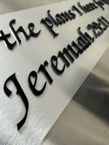
- Aluminum and stainless steel: Ideal for exterior façades and upscale interiors. Aluminum offers a strong strength-to-weight ratio, takes paint well, and resists corrosion when finished correctly. Stainless steel delivers premium looks in brushed or polished finishes and exceptional durability. TSG’s precision laser cutting and CNC finishing produce clean edges and consistent letter sets, and our paint booth supports Pantone color matching for brand fidelity. When you need edges that look machined, consider our precision laser cutting and laser cutting aluminum services for repeatability.
- Acrylic: A go-to for interior wall branding and moderate exterior exposure. It offers glossy edges when laser cut, consistent thickness, and a broad color range. Clear acrylic can be second-surface painted for depth. For tight radii and crisp inside corners, TSG uses acrylic laser cutting to keep edges bright and chip-free.
- PVC: A practical choice for budget-conscious interiors and some exterior applications when finished with the right coatings. It is easy to route, lightweight, and forgiving in install. Use when cost and quick turnaround matter more than a glassy edge.
- Wood: Adds warmth in offices, hospitality, and boutique retail. Best for interiors due to moisture sensitivity. Seal and finish well, and mind mounting points to avoid splitting.
Finishes and sheens matter. Painted aluminum can match Pantone values in satin, matte, or gloss. Stainless and aluminum can be brushed, polished, or clear-coated. Acrylic can be glossy or back-painted for dimensional depth. If a client asks for metal-without-the-weight, consider aluminum composite faces laminated to standoff backers or back-painted acrylic that mimics a metal sheen.
Mounting methods that save time
Your mounting choice impacts install speed, wall conditions, and serviceability.
- Stud mount: Best for exterior walls, masonry, and high-traffic interiors. You get strong mechanical attachment and consistent alignment using a paper template with hole marks. Use spacers for stand-off depth. Seal penetrations on exterior installs.
- VHB plus silicone: Effective on smooth interior walls and ACM or metal façades when penetrations are discouraged. Clean surfaces thoroughly, use primer where specified, and combine structural VHB tape with a thin bead of silicone for creep resistance. Verify paint integrity on drywall before committing.
- Rail systems and engineered strips: Great for complex logos, uneven surfaces, or when future repositioning could happen. TSG fabricates concealed cleats and engineered mounting strips in-house so your set lands level with fewer wall penetrations. Rails can speed up multi-letter installs and maintain exact baselines over texture.
Paper template tips:
- Print full-size templates with centerlines, baselines, stud locations, and reference dimensions.
- Tape, level, and cross-measure between fixed architectural points.
- Pounce or drill through the template before removing it so your pattern does not drift.
- Keep an extra template onsite in case the first one tears during drilling.
How to make letters look truly 3D
Depth and shadow are your allies. Here are practical ways to enhance dimensionality.
- Increase material thickness: Jumping from 1/4 inch acrylic to 1/2 inch immediately amplifies the visual. For metal, consider 3/8 inch to 1/2 inch aluminum for exterior legibility.
- Add stand-offs: Even a 1/4 to 1/2 inch stand-off from the wall introduces a crisp shadow line.
- Use layered construction: Stack a contrasting backer behind the face letters to create a reveal. Acrylic-on-metal or metal-on-painted backers read premium.
- Back-paint clear acrylic: The glossy, glass-like edge combined with solid-color backs looks deep and refined.
- External wash lighting: A discreet linear LED aimed across the set can make non-illuminated letters read at dusk without going full channel letter.
When to step up to channel letters or push-through faces
Dimensional letters excel when you want a clean, non-illuminated look, straightforward mounting, and strong brand presence at moderate cost. Step up to illuminated solutions when visibility is critical after dark or you need long-distance legibility.
- Choose channel letters when: You need internal illumination, individual letter control, halo or face-lit effects, or building codes require lit identification. For details on fabrication options, see our overview of channel letter signs and channel letters.
- Choose push-through faces when: You are building an illuminated cabinet or blade sign and want letters that sit proud of the face. Push-through acrylic provides a crisp lit edge and face, with robust weather protection from the cabinet body. This can outperform small, intricate channel letters on complex logos.
Keep wall access and power in mind early. Channel letters need primary power, proper raceways or penetrations, and service access. For cabinets with push-through, plan cabinet depth, LED layout, and face retention for maintenance.
ADA and wayfinding tie-ins
Dimensional letters often sit alongside ADA and wayfinding programs. Coordinate character heights, contrast, and placement for a cohesive package. For room IDs and compliance projects, TSG produces Grade 2 Braille signs and tactile ADA panels that pair well with dimensional lobby branding. For campus or large-facility navigation, integrate post and panel or wayfinding signs to guide visitors to branded entries. Align finishes across lobby signs and door signs or custom office door signs so the space reads as one system.
If you are mapping an entire building, request our ADA collaboration guidance to align ADA signage requirements with your dimensional and directional sets.
Measurement and mounting checklist
Hand this to your field lead before leaving the shop.
- Verify artwork scaling against site conditions. Confirm letter heights for legibility at target viewing distance.
- Confirm substrate thickness and stand-off depth. Note wall type, access, and any hidden utilities.
- Produce a full-size paper template with centerlines, baselines, stud locations, and reference dimensions.
- Dry fit on the wall. Level, cross-measure, then mark all holes before removing the template.
- For studs: Drill to specified depth, test-fit a sample letter, apply exterior-grade sealant on penetrations as required.
- For VHB plus silicone: Clean surfaces, apply primer where specified, use controlled tape coverage, then set with even pressure and a thin perimeter silicone bead.
Installation basics, start to finish
- Unbox and inventory letters against the packing list. Protect finished faces from the ground.
- Test-fit two key letters on the template to confirm baseline and spacing.
- Proceed with drilling or surface prep per the chosen method. Keep hardware organized by letter.
- Mount from center outward to control cumulative spacing. Re-level after every three to four letters.
- Remove template, clean residue, and inspect for squeeze-out or smudges. Touch up paint as needed.
TSG supplies installation-ready hardware options and engineered strips to simplify these steps. Our CNC and laser teams deliver consistent stroke widths and hole placements so your template and hardware align perfectly onsite.
FAQ
- What is a dimensional letter?
An individually cut letter or logo element with real thickness, mounted to a wall or façade to create a 3D effect. Typically non-illuminated, though you can light them with external fixtures.
- How do I install dimensional letters?
Use a full-size paper template to mark positions, then mount with studs, VHB plus silicone, or rail systems based on wall type and exposure. Seal exterior penetrations and verify level often.
- How can I make my letters look 3D?
Increase material thickness, add stand-offs, layer contrasting backers, back-paint clear acrylic, or add subtle wash lighting.
- Is creating 3D letters difficult to learn?
With clean vector files and the right fabrication partner, producing 3D letters is straightforward. Installation basics are teachable with a good template and a consistent process.
- What is the difference between acrylic letters and channel letters?
Acrylic letters are solid, non-illuminated dimensional pieces cut from acrylic sheet. Channel letters are fabricated, hollow letterforms with internal LEDs for face-lit, halo-lit, or combination effects.
When precision matters, partner with TSG
Pre-summer fit-outs reward reliable tolerances and installation-ready packages. TSG’s industrial laser and CNC routing provide crisp edges, smooth curves, and matched sets for quick installs and fewer field adjustments. If you need help selecting between dimensional letters, channel letters, or a push-through approach for cabinets or lightbox signs, our wholesale team can review artwork and exposure details to recommend the best path.
Request a wholesale quote via our contact form or email the wholesale team at sales@txsign.us with artwork and project specs. Include:
- Vector artwork files (PDF, AI, EPS)
- Approximate dimensions and letter heights
- Interior or exterior exposure and preferred materials
- Mounting context and wall type
- Quantity and color or finish requirements (Pantone if needed)
- Project timeline or delivery window
Helpful resources
- Compare illuminated options and see what fits your façade in our overview of illuminated signs.
- Explore fabrication capabilities for metal and acrylic, including precision laser cutting, CNC laser cutting, and laser cutting services, to understand edge quality and tolerances.
- See how dimensional sets complement interior branding across lobby signs and customizable office signs or door signs.
Summary: Dimensional letters deliver clean, brand-forward results across interiors and façades with simple mounting and a wide material palette. Use acrylic or metal for crisp edges, pick the right install method for the wall, and step up to channel letters or push-through faces when night visibility or long-distance read matters. For consistent sets that install smoothly, request a wholesale quote with your vector files and specs, and TSG will help you hit your summer window.