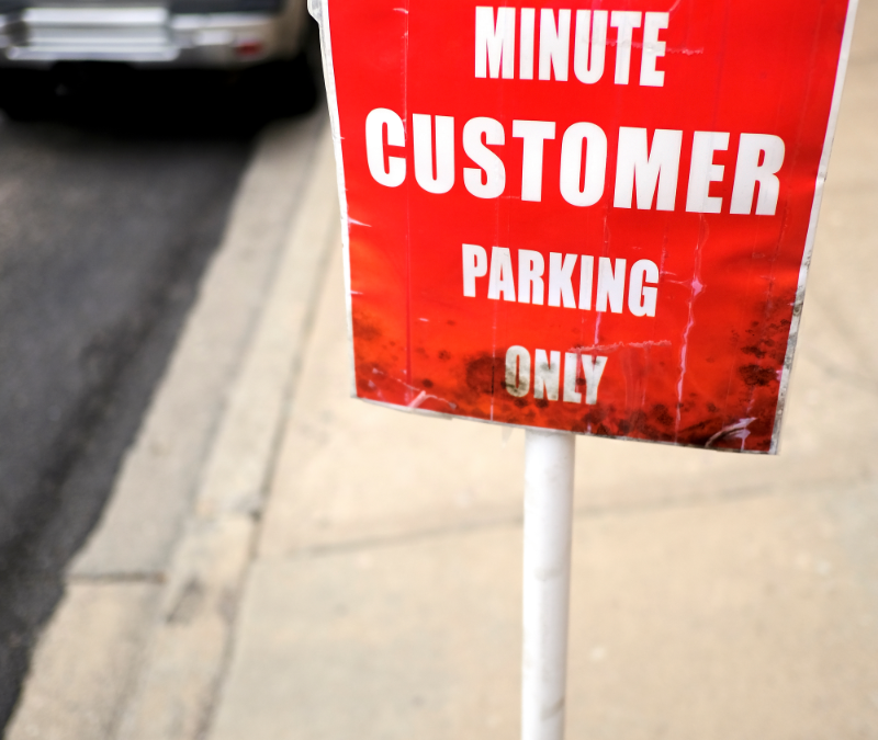
In the vibrant world of signage, where every corner tells a story and every storefront beckons with its unique appeal, the importance of effective signage cannot be ignored. As a wholesale sign shop nestled in the heart of Central Texas, we’ve seen the highs and lows of the signage industry firsthand. Over the years, we’ve witnessed numerous businesses stumble upon avoidable pitfalls that can dampen their signage success. Now we’re shedding light on some of the biggest mistakes people make with signs, and more importantly, how fellow sign companies can avoid them.
Lost in Translation: Clarity is Key
One of the most common blunders we’ve observed is signage that fails to communicate its message clearly. Whether it’s overly complicated graphics, cluttered text, or confusing layouts, signs that leave customers scratching their heads are a missed opportunity. To avoid this, prioritize simplicity and clarity in your designs. Ensure that your message is concise, easily readable (especially at the average viewing distance from the sign), and instantly understandable to your target audience.
Size Matters: Don’t Get Lost in the Crowd
Oversized or undersized signage can spell disaster for businesses. An excessively large sign may overwhelm its surroundings or even violate local regulations, while a tiny sign may go unnoticed amidst the hustle and bustle of the streets. Strike the right balance by considering factors such as viewing distance, location, and surrounding environment when determining the size of your signage.
Color Chaos: Choose Wisely
The colors you choose for your signage play a crucial role in grabbing attention and conveying your brand message. However, an overly vibrant palette or clashing color combinations can have the opposite effect, turning potential customers away. Take the time to understand color psychology and opt for hues that resonate with your brand identity, while also remaining visually appealing and easy on the eyes.
Font Fiascos: Select with Care
The typeface you select can make or break your signage. Fonts that are too elaborate or difficult to read at a glance can frustrate viewers and diminish the impact of your message. Stick to clear, legible fonts that align with your brand’s personality and ensure optimal readability across various viewing distances. Sans serif fonts like Arial and bolded or block fonts might be ideal for legibility.
Neglecting Maintenance: Preserve Your Investment
Your signage is a reflection of your business and neglecting its upkeep can send the wrong message to potential customers. Faded colors, peeling paint, or burnt-out bulbs not only detract from your brand’s image, but also convey a sense of neglect. Make regular maintenance a priority to keep your signage looking fresh and inviting year-round.
Ignoring Regulations: Stay Compliant
Navigating local regulations and zoning laws can be a daunting task, but overlooking them can have serious consequences for your business. From size restrictions to placement guidelines, familiarize yourself with the relevant regulations in your area and ensure that your signage complies with all applicable laws.
While the signage landscape may be fraught with challenges, armed with the knowledge of these common pitfalls, fellow sign companies in Central Texas can navigate the terrain with confidence and finesse. By prioritizing clarity, size, color, typography, maintenance, and compliance, we can collectively elevate the standard of signage excellence in our community, one sign at a time. Partnering with an experienced sign manufacturer can help provide signage success that leaves a lasting impression on all who encounter it.

